Building the Leap Design System
Leap Scholar · Design system
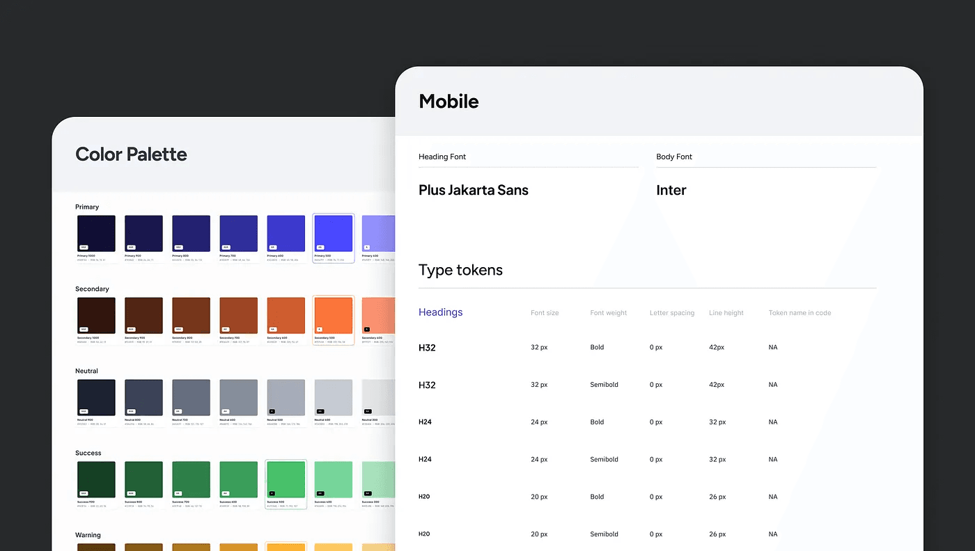
A little about Leap
Leap helps Indian students chase their dream of studying abroad. From picking the right university to helping with applications, finances, and even job prep — we’re with them at every step.
But as our products grew, we ran into a problem: inconsistency. Different teams were designing and building at different speeds. That meant duplicated components, mismatched visuals, and a lot of extra time spent redoing work.
We knew it was time to fix this.
What we wanted to achieve
Our goal was simple:
- Consistency across every product.
- A component library that was reusable and scalable.
- Cut down design and dev time to 1/3rd of what it used to be.
My role
I led the design system project from the design side. That meant:
- Researching and benchmarking other systems.
- Figuring out what would work for Leap’s products.
- Defining the structure.
- Testing components inside real product flows before rolling them out.
Basically, my job was to make sure the system wasn’t just “pretty” in Figma but actually useful for designers and developers day-to-day.
How we approached it
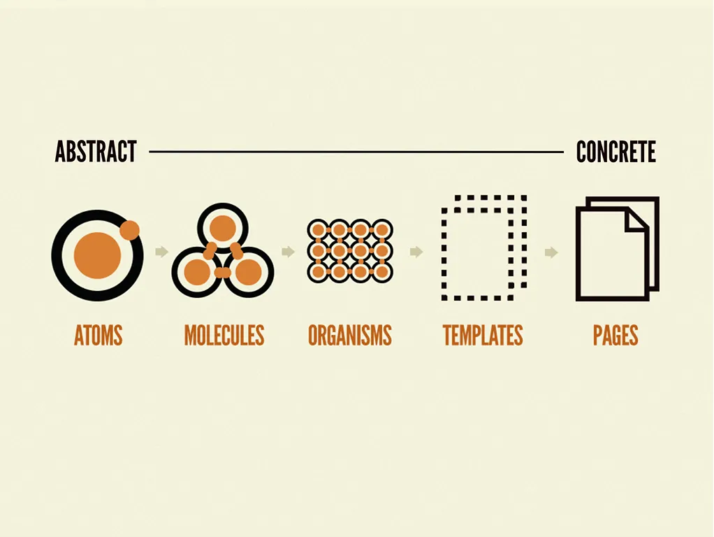
We structured our approach similar to frameworks outlined in Brad Frost’s Atomic Design and Alla Kholmatova’s Design Systems, moving from defining foundational atoms → combining them into reusable molecules → scaling into flexible components.
1. Research & alignment
We spoke with front-end devs, PMs, and even marketing to understand where gaps existed. Four big goals came out of those conversations:
- Fix design gaps across existing products.
- Learn from the best design systems out there.
- Standardize components so they could work across multiple products.
- Create a solid list of atoms as the foundation.
2. Benchmarking
We studied Atlassian, IBM, Blade, Loom, Material Design — and noticed patterns in how they structured things. This gave us a blueprint for what we needed at Leap.

3. Building it out
Atoms (the basics):
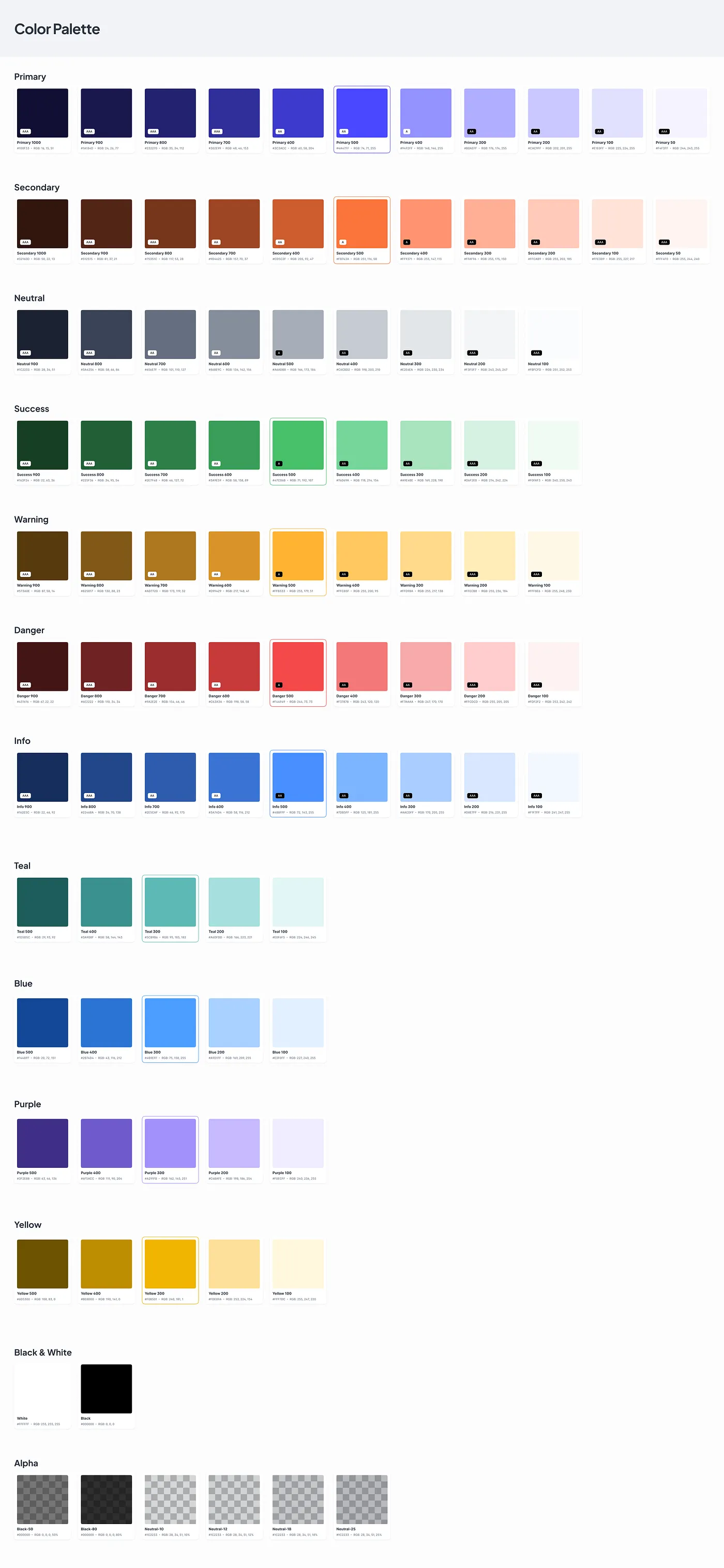
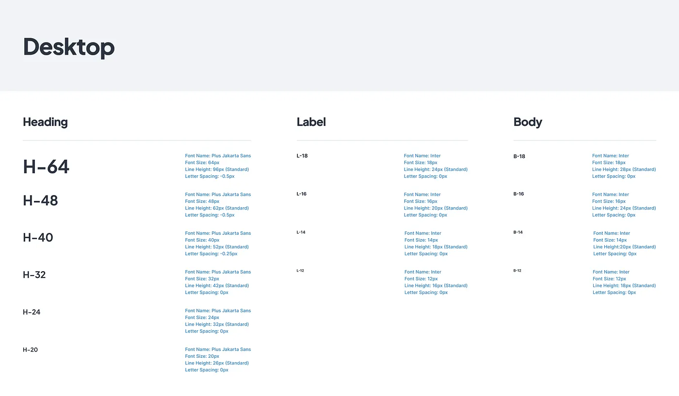
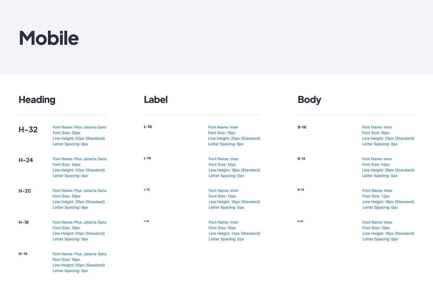
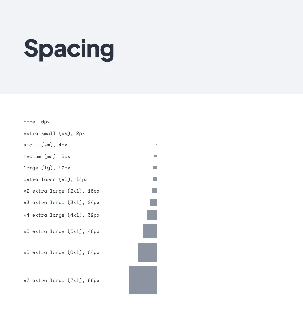
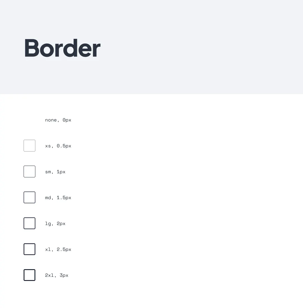
- Colors, typography, spacing, radius — all defined as Figma variables.
- Primitives vs Tokens → raw values vs contextual usage.
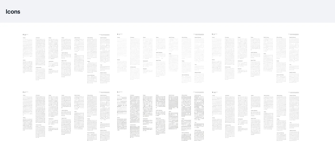
- Chose the Phosphor icon set after testing a bunch of libraries.
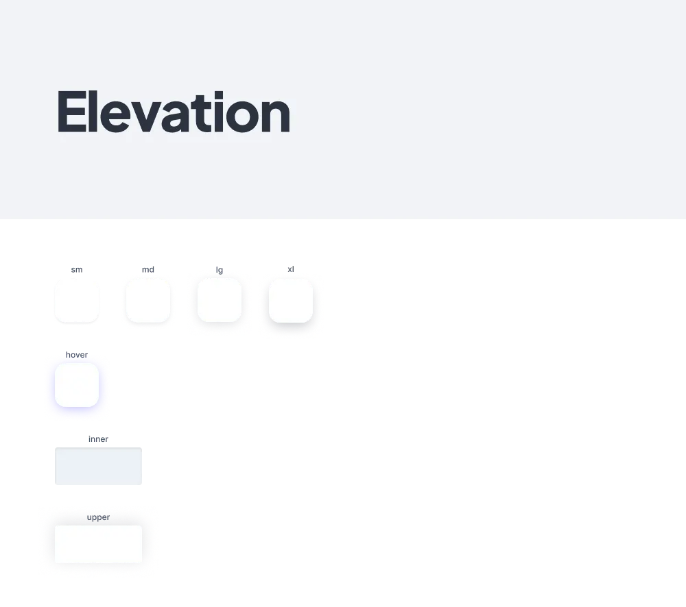
- Shadows: 4 levels (small → XL) plus hover/inner/upper variants.
- Responsive grids (640px → 1800px+) and layouts for sidebar behavior.
- Logo usage guidelines for different contexts.
Molecules (the building blocks):
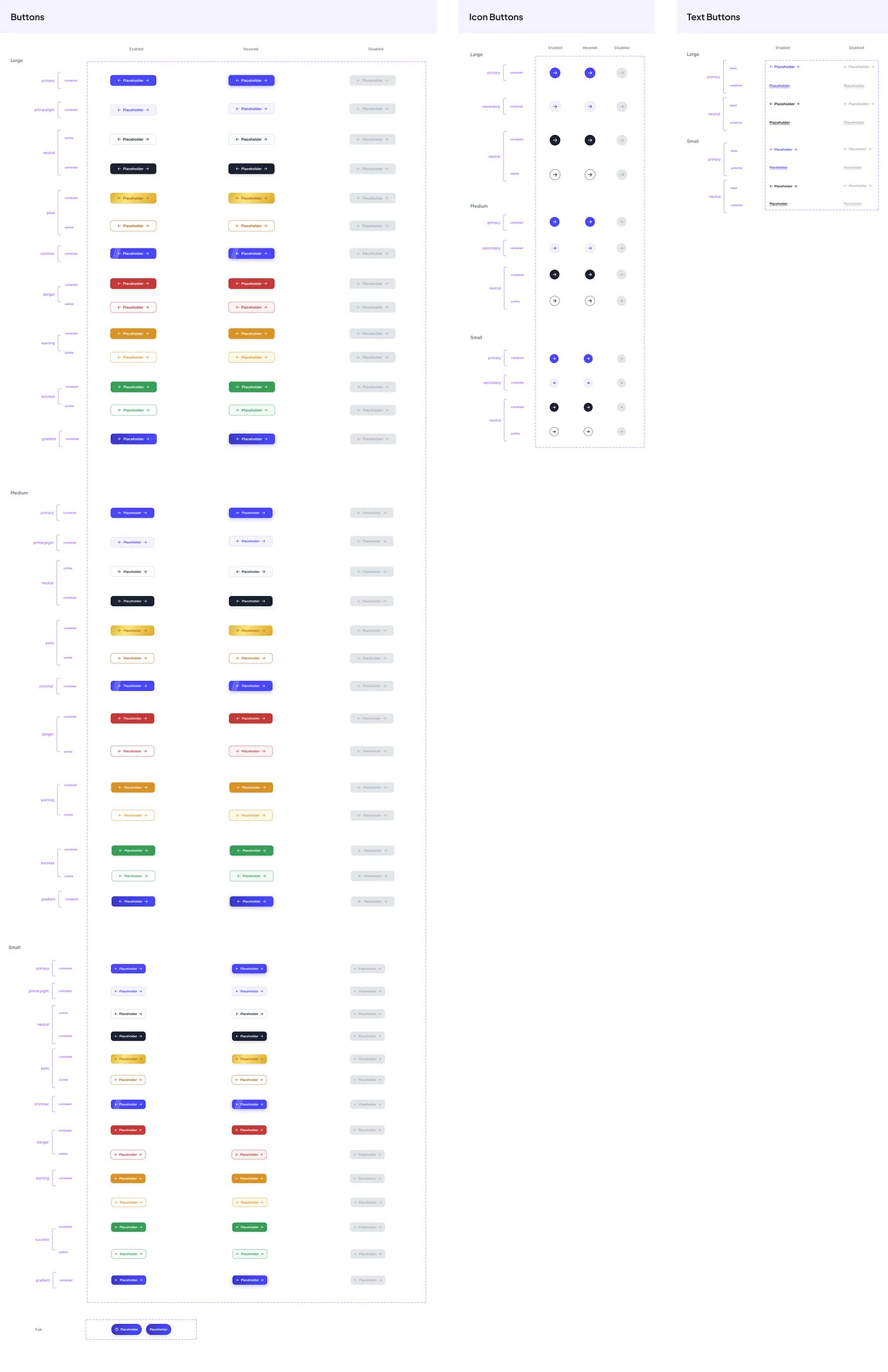
- Buttons → 3 types, multiple variants (primary, neutral, success, danger, warning).
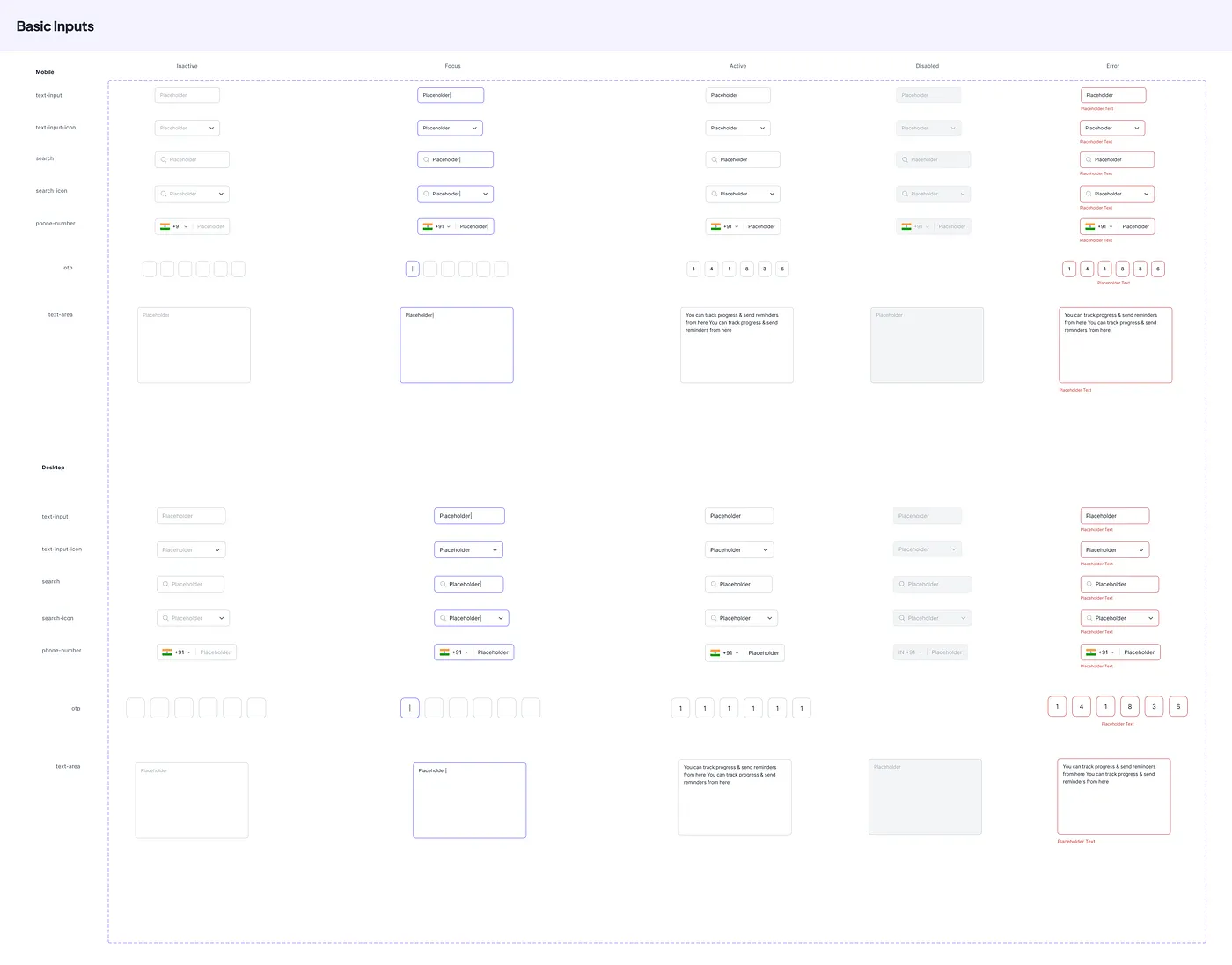
- Inputs → text, phone, OTP, search + states like error, disabled, focus.
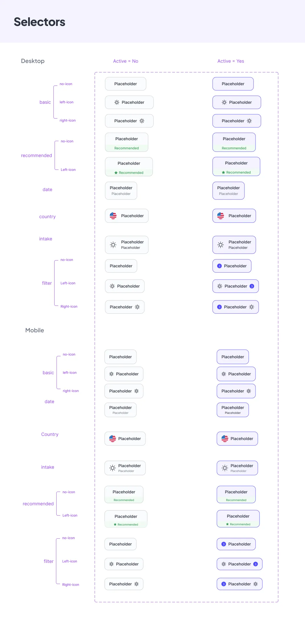
- Selectors → dropdowns, date pickers, country pickers, intake selectors.
- Cards → flexible templates; 60% of all cards can now be created from them.
- Tags → outline & filled, each with semantic states.
- Tooltips → quick contextual help.
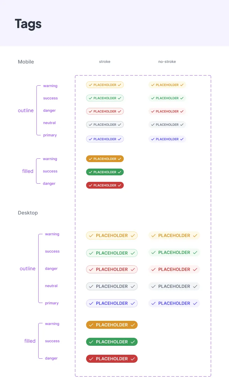
…and plenty more (all documented neatly in Figma) Figma Link
The impact
- A consistent look & feel across every Leap product.
- Designers and devs working 3x faster than before.
- A scalable UI library that worked for both apps and landing pages.
- Less back-and-forth, because everyone was finally speaking the same design language.
What I learned
- A design system isn’t just components — it’s about alignment between teams.
- Benchmarking saved us from reinventing the wheel.
- Testing early inside real products made adoption much easier.
Thanks for reading.