DROP-IN
App design
- Role
- Product designer
- Timeline
- 4 weeks
- Team
- Founder, Club Manager and Co Founder
Overview
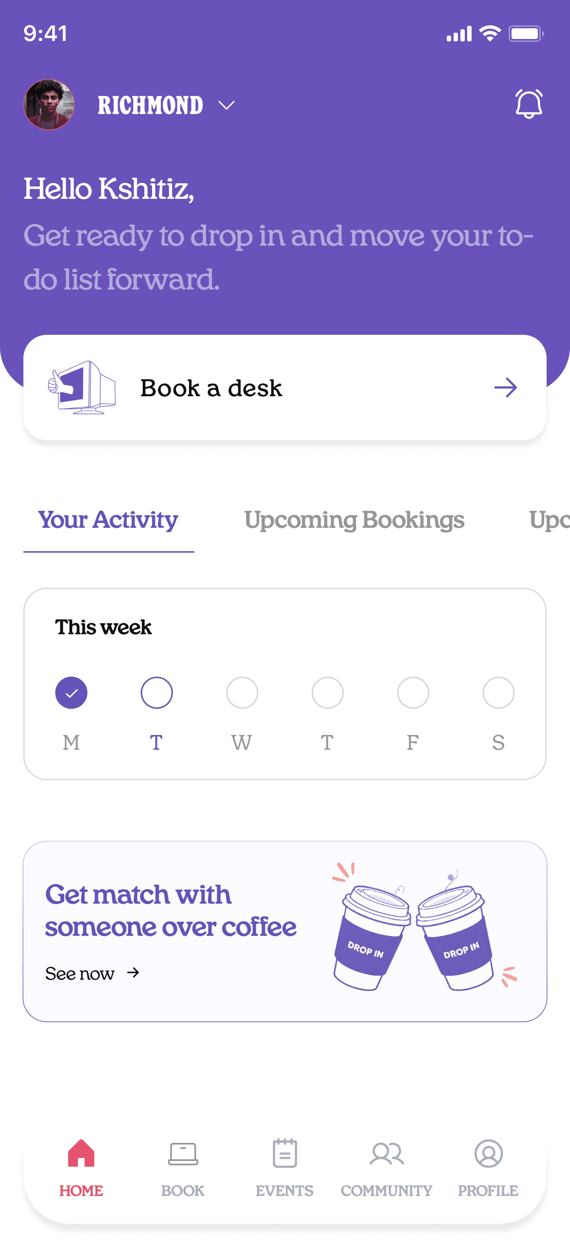
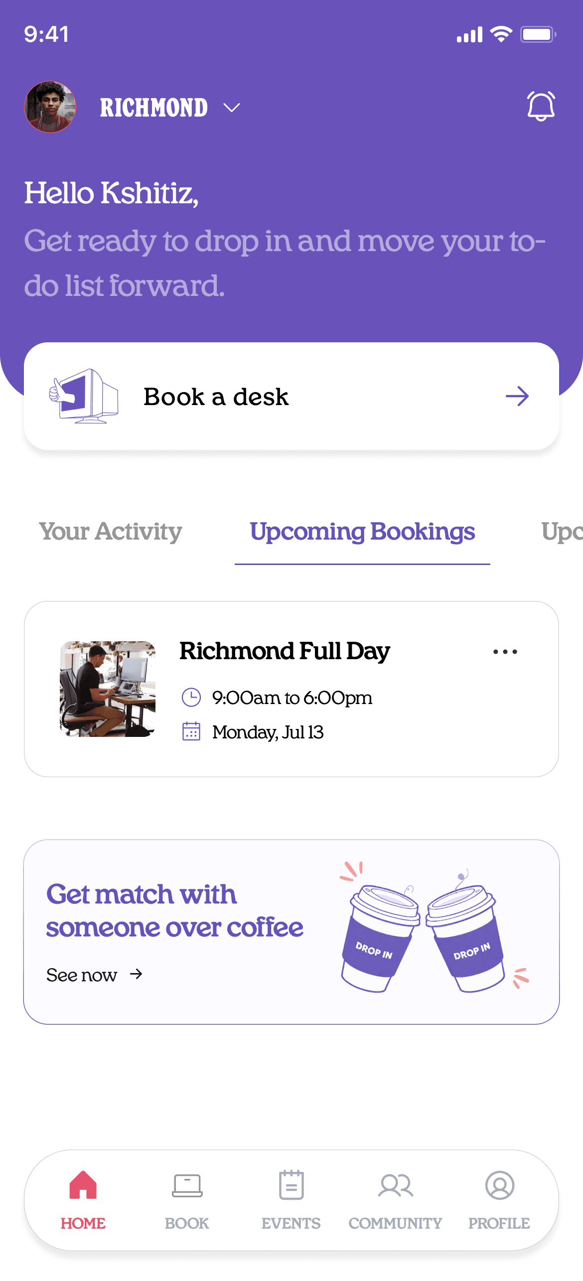
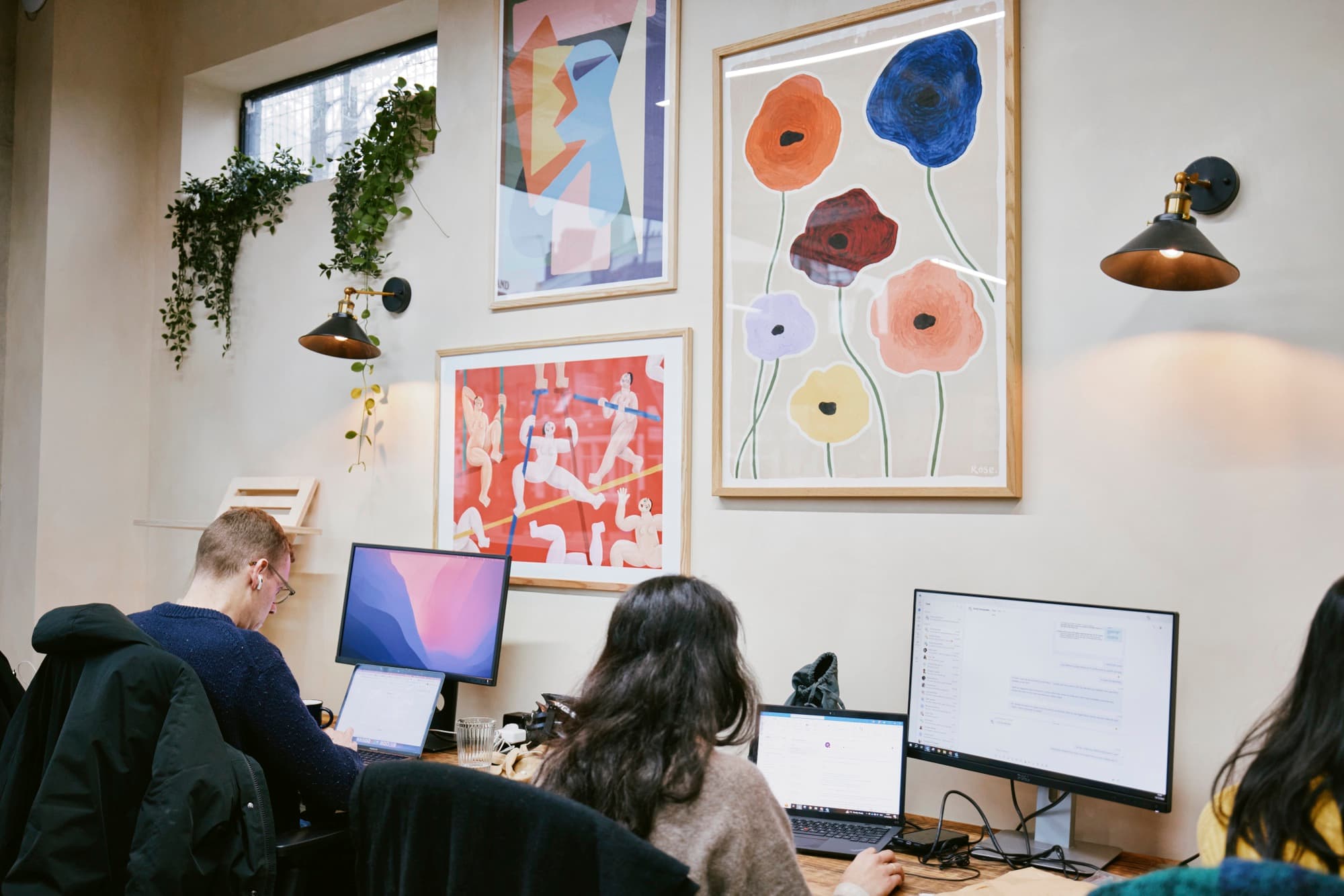
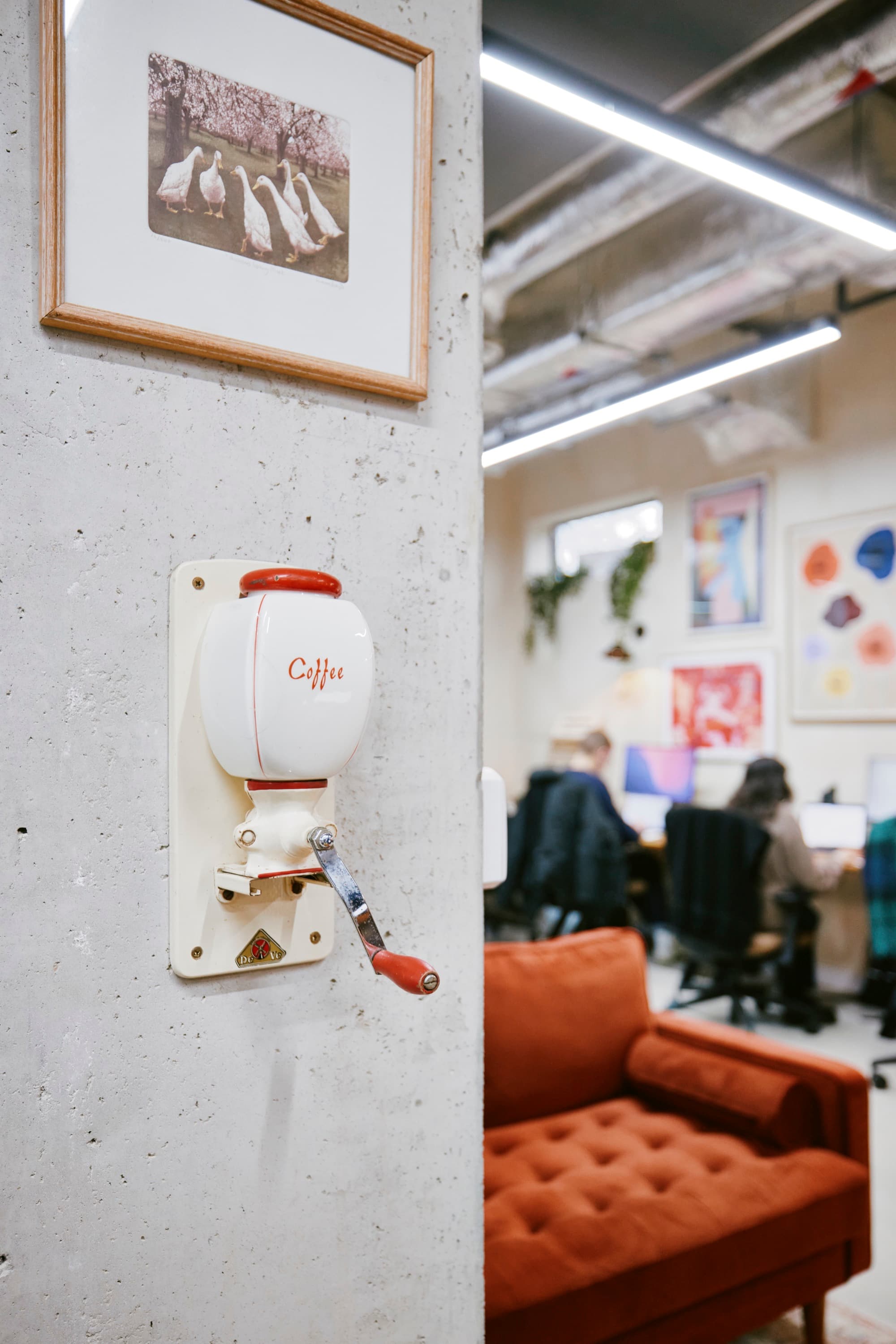
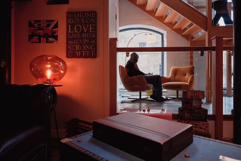
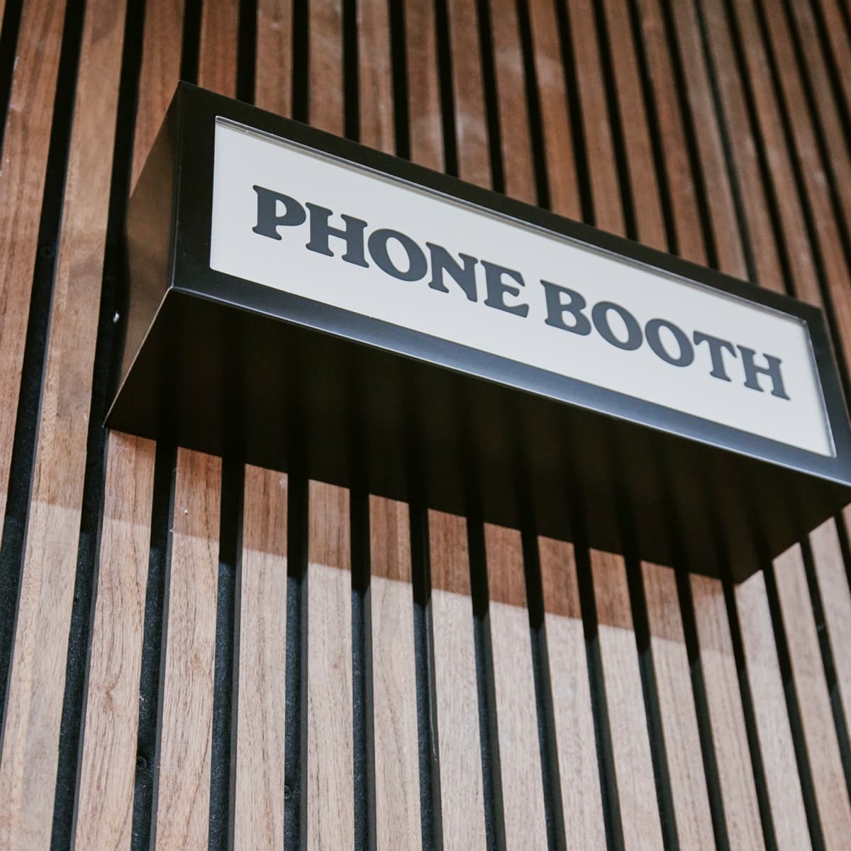
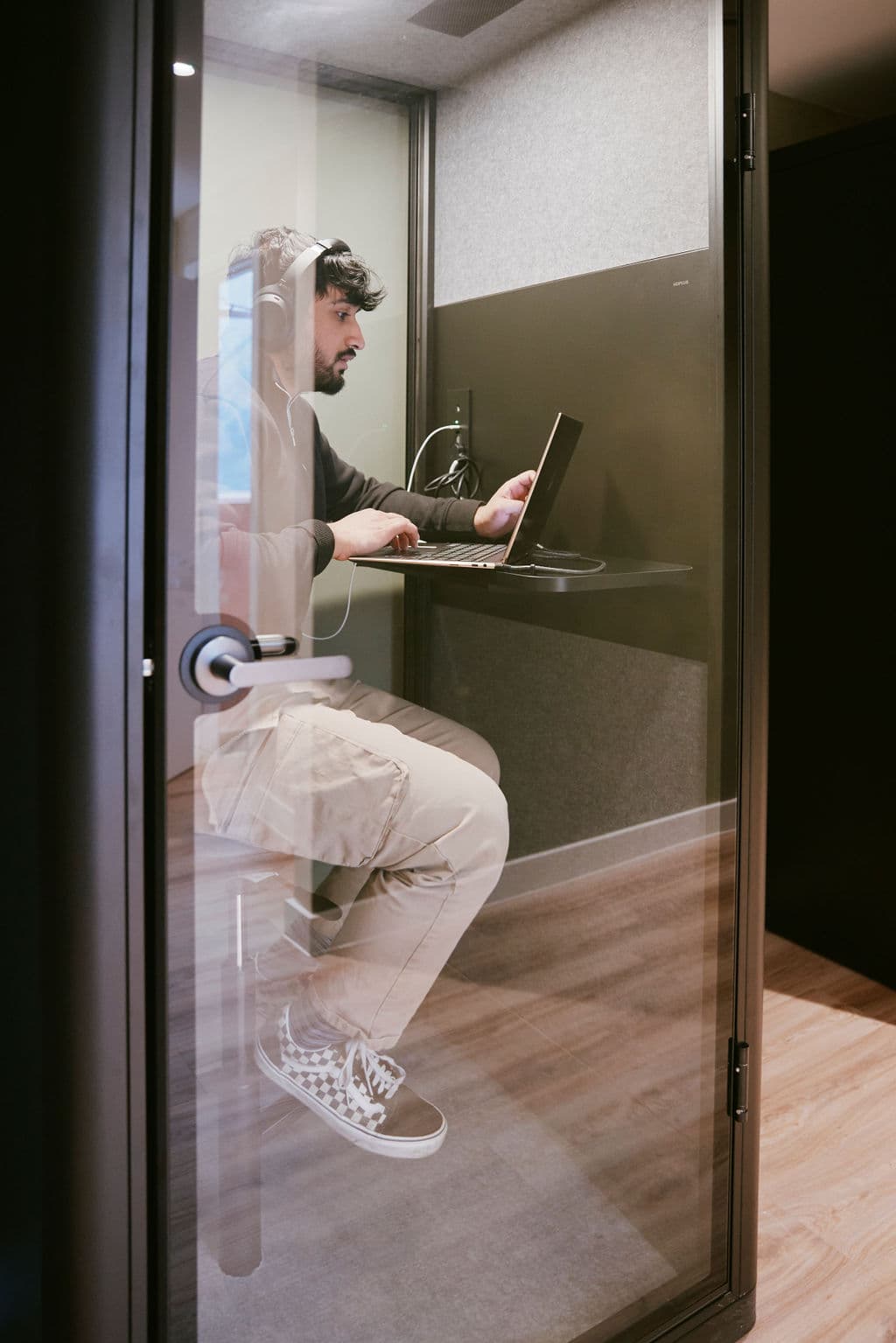
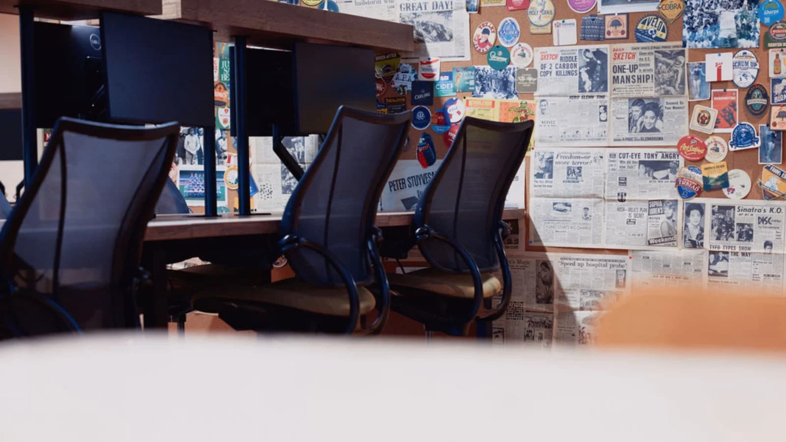
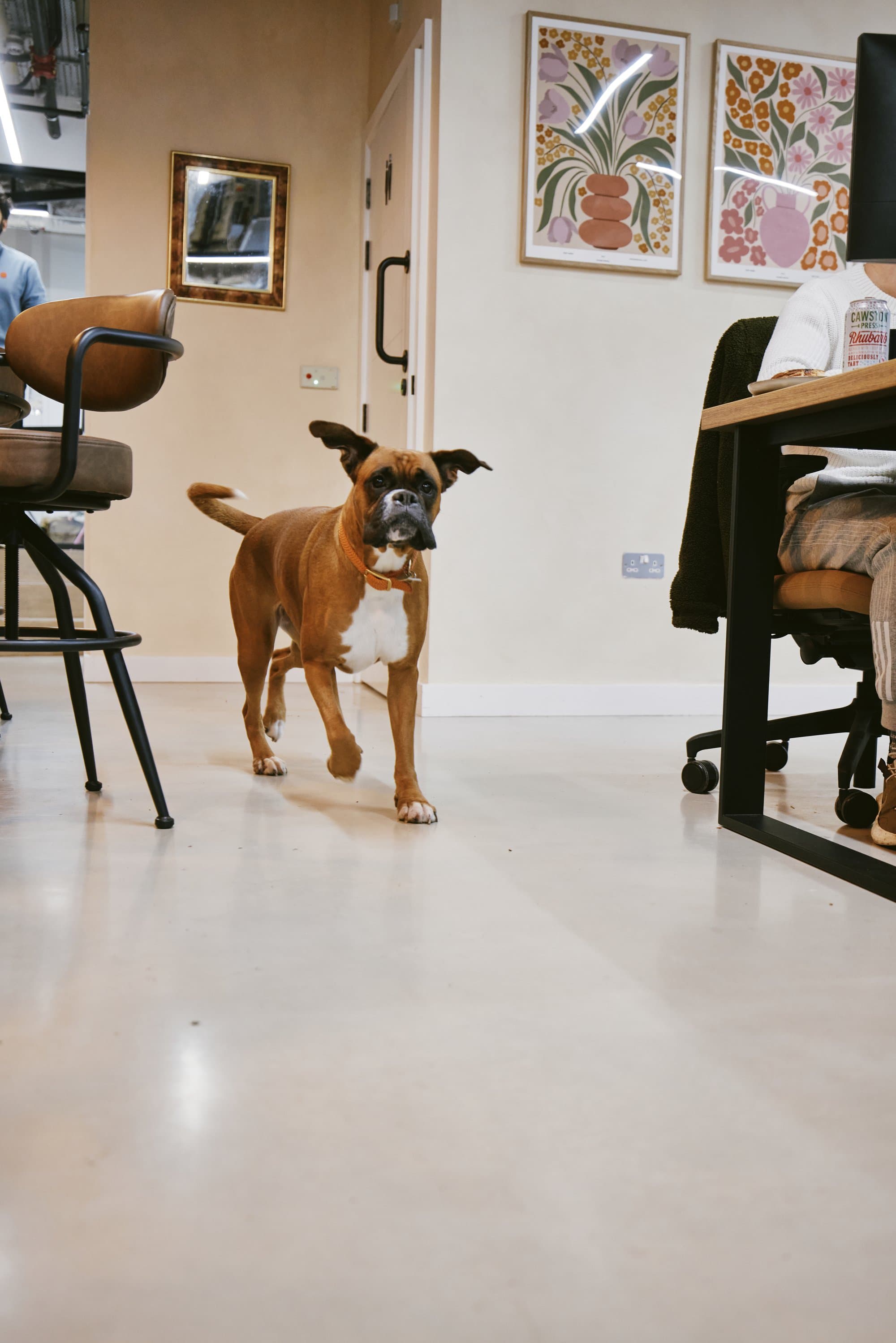
Drop-in is an independent work club and coffee house with three sites in London: Clapton, Richmond and Wandsworth. Members rent desks, phone booths and meeting rooms by the hour.

What did I do?
- Product strategy and the pitch to build in-house
- User research
- UI design in Figma
- Building the iOS app in SwiftUI with Claude Code
Project timeline
Four weeks, six phases. We started by running a survey with users and understanding the problems with the current app. The main issues were getting through the door and the annoying payment pop-up that appeared every time they opened the app. Then, I made the case for building our own app and why we couldn’t fix these issues within the current one. Design came next: the flows and screens. The build was done in SwiftUI on top of the existing Optix API. We tested it with a few members first through TestFlight and then shipped it at the end.
Ran a survey with users
Week 1Pitch to build in-house
Weeks 1 to 2Design the flow
Weeks 1 to 3Build the app using SwiftUI and the Optix API
Weeks 2 to 4Test with members through TestFlight
Weeks 3 to 4Ship
Week 4
Problems with the app we had
- Books a desk most weeks at Clapton
- Uses the gates several times a day
- Opens the app on a Tuesday morning to book a desk before heading in
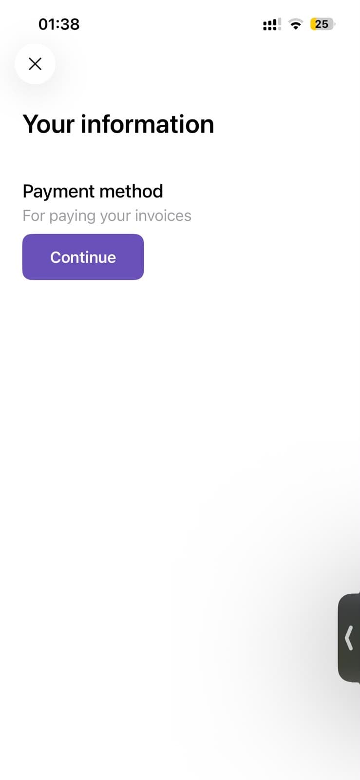
Every time I open it there's a pop-up before I can do anything. I only came to book a desk.
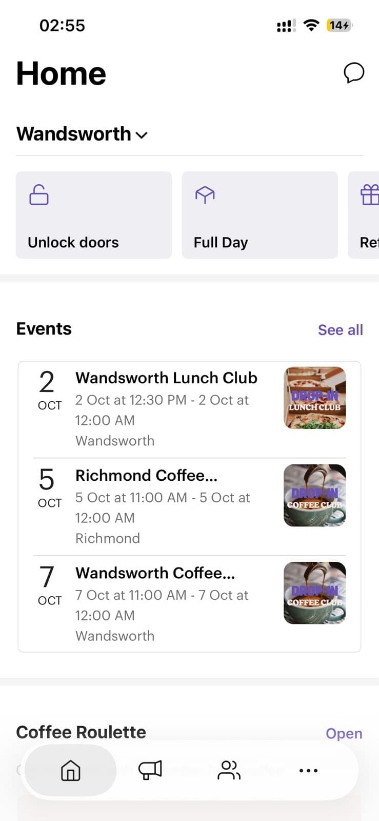
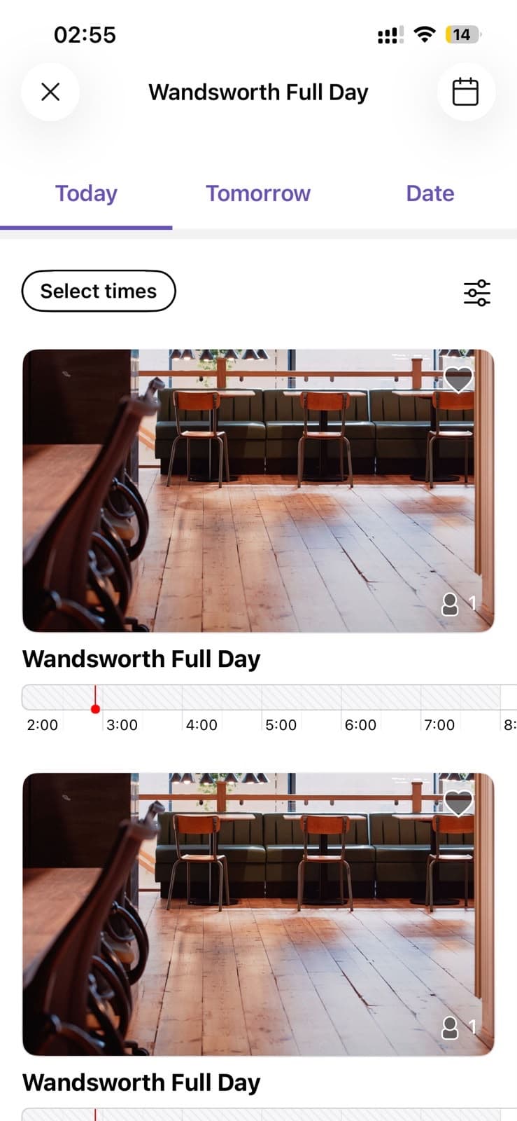
I never know which one to pick. The names don't tell you whether it's a desk or a room.

Valentina
- Books a desk most weeks at Clapton
- Uses the gates several times a day
- Gets to the club and opens the app to let herself in
That's a lot of steps just to open a door. Ohh, I have to do these every time I want to get in.
Valentina
The main blocker
We couldn't change things in the app easily, because it was built using a third-party software called Optix.
Main decision
Since there was so little we could change in the app we had, the real question was whether to build our own. We put both options side by side and wrote out the pros and cons: keep asking Optix for changes, or build a new front end on the same data.
Deciding factors
Wireframes
I sketched a few different options for every screen, from booking and doors to bookings and events, and kept iterating on them until the flow felt right.
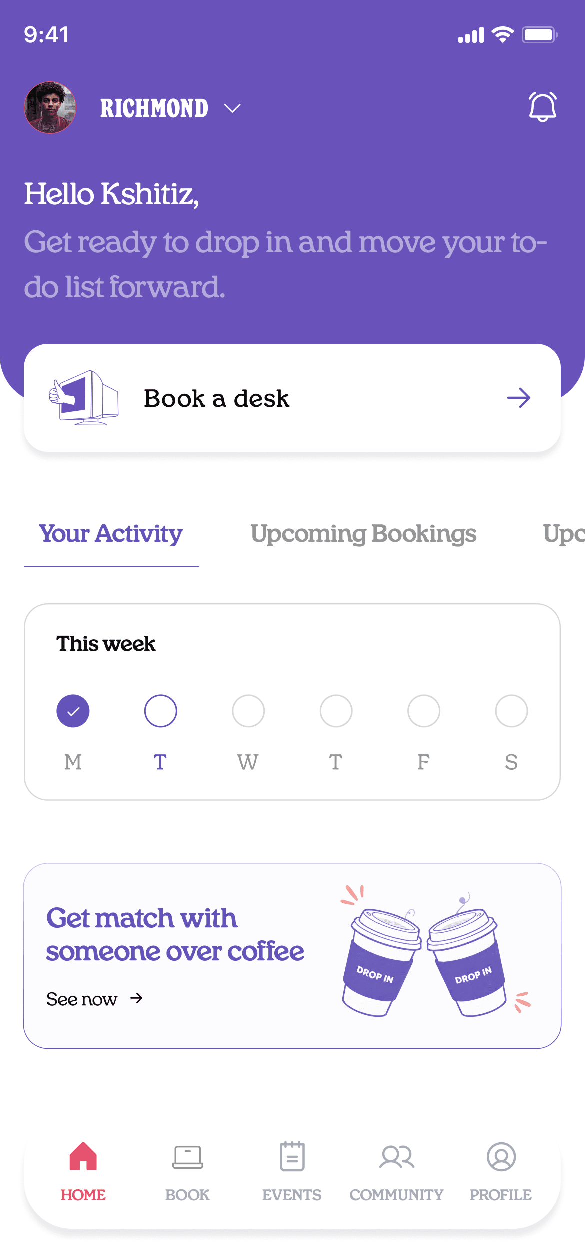
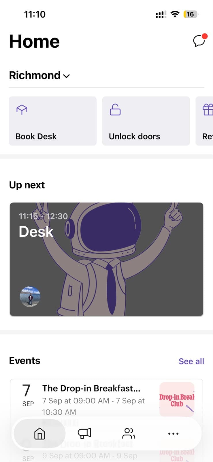
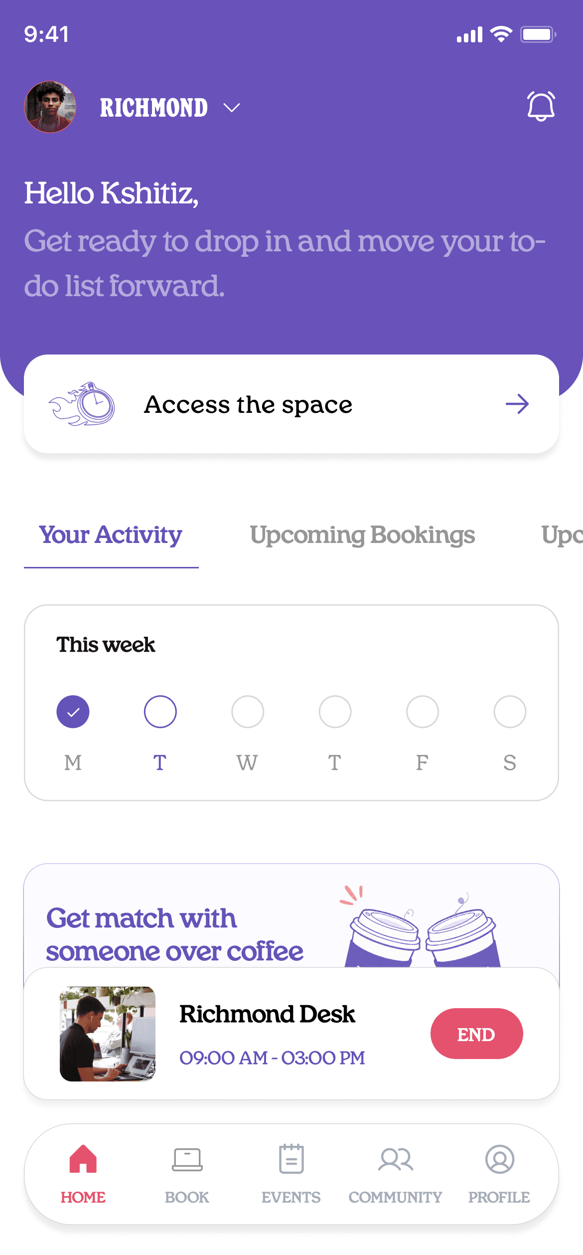
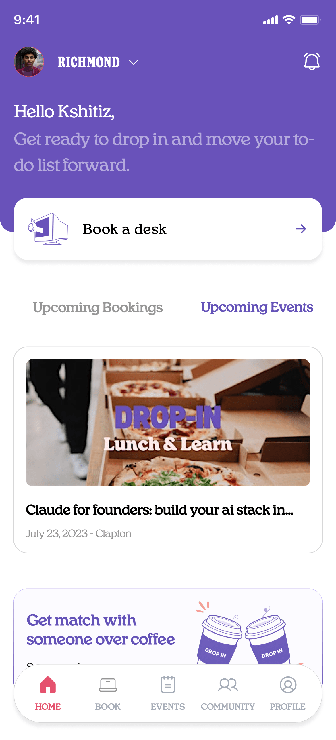
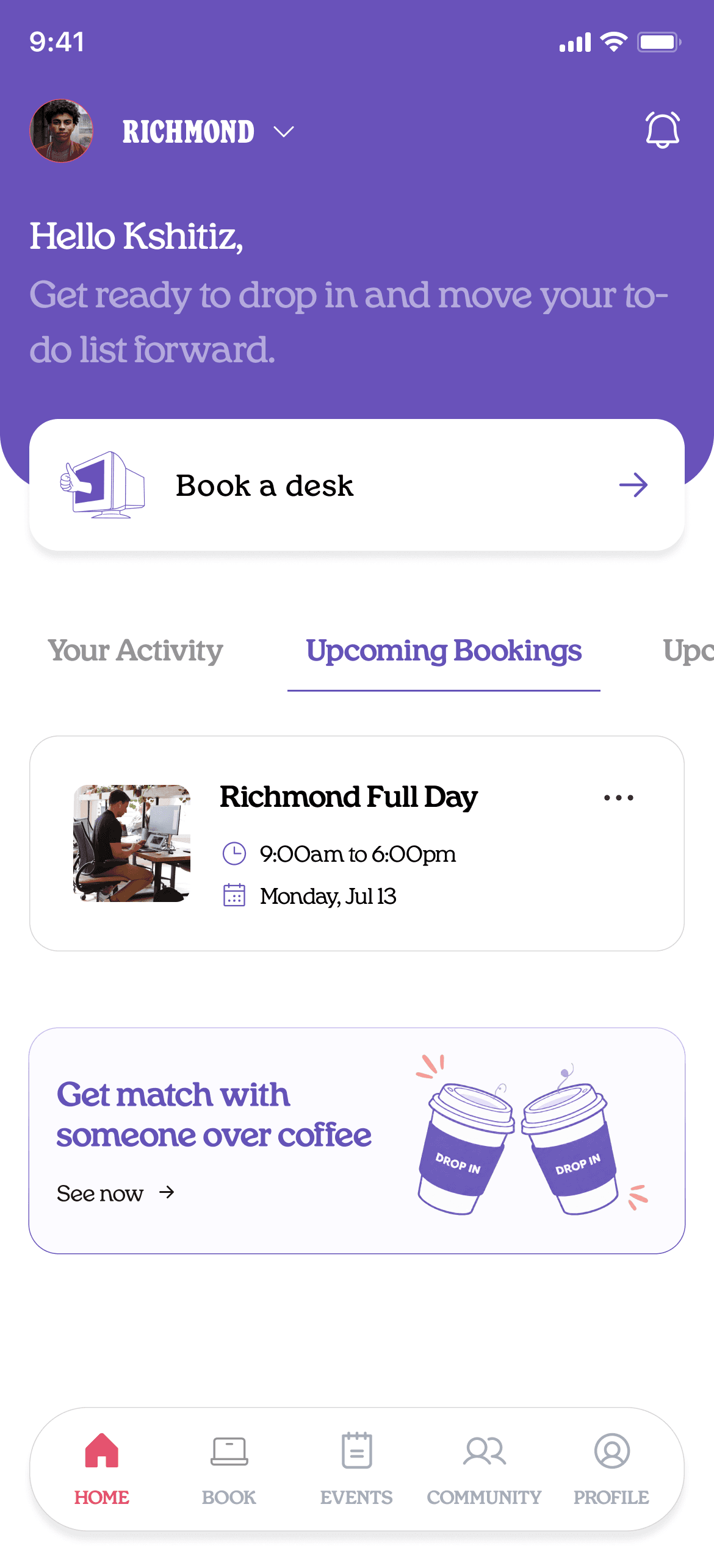
Redesigned the homescreen
The old app put a payment method in front of you before it let you do anything. Added a clear Book a desk button, as this is the main action members take.
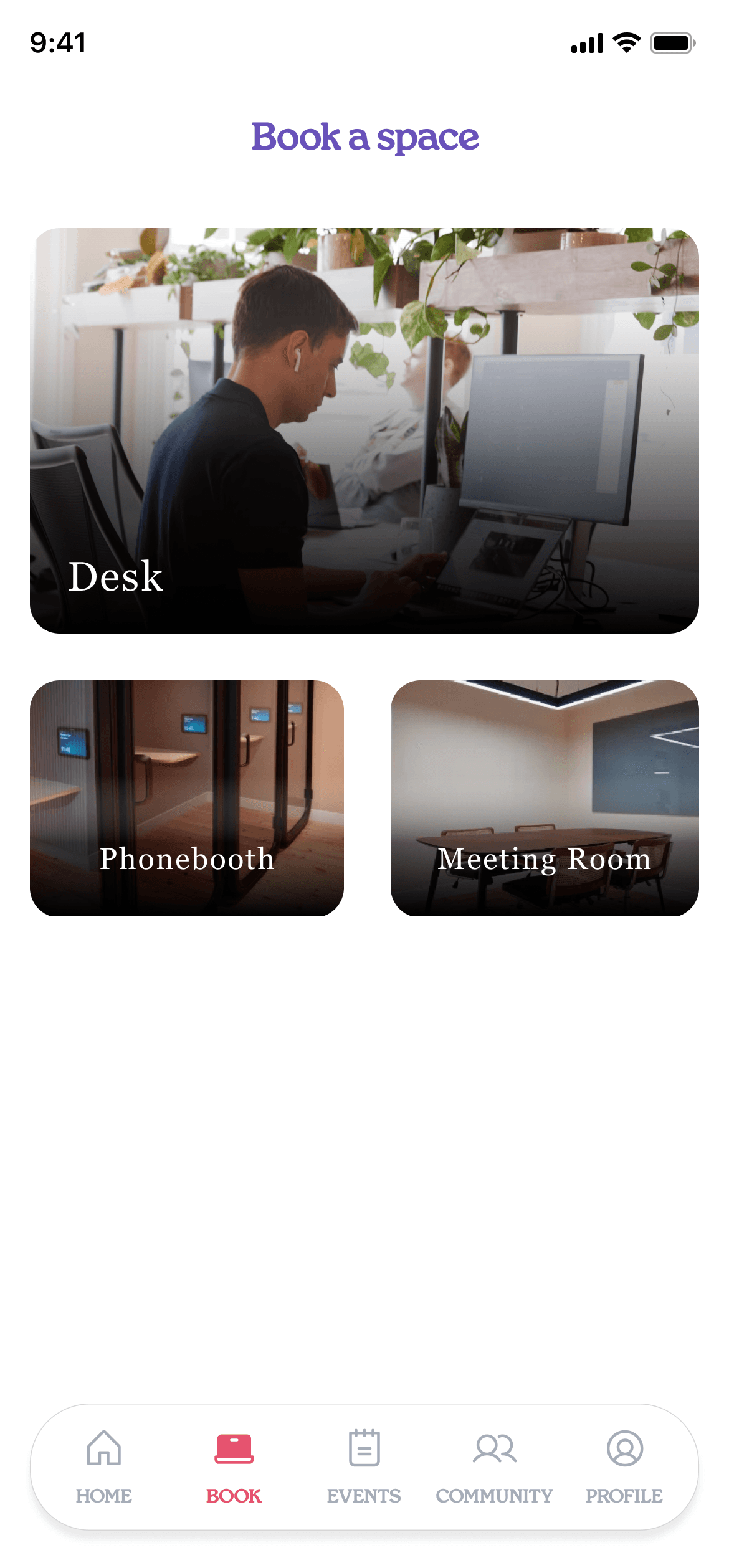
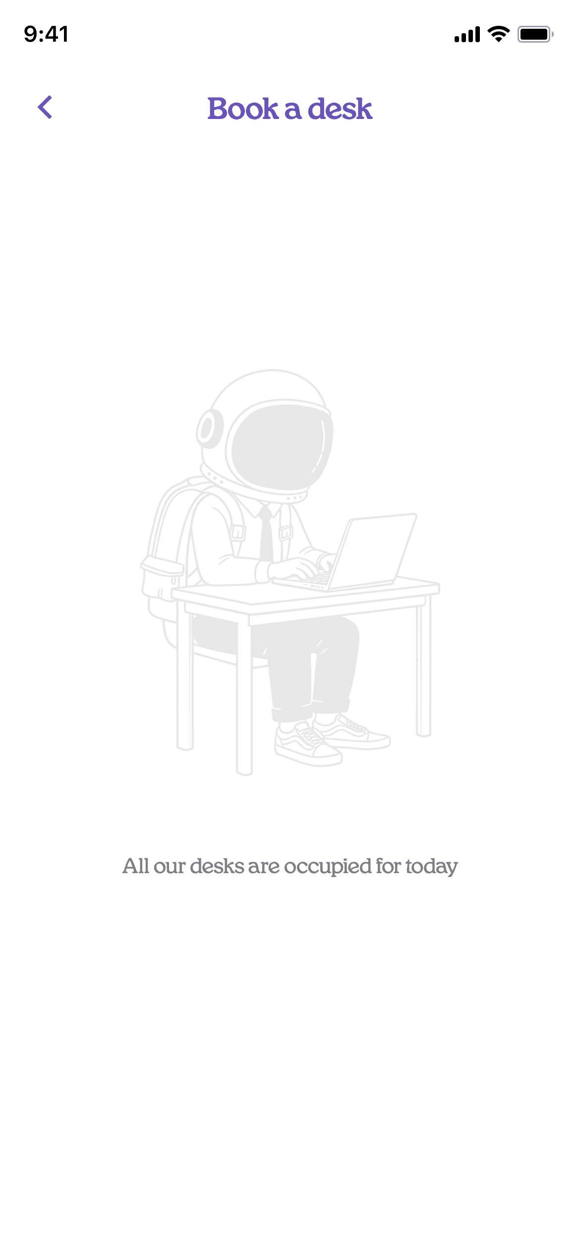
Clear resource type
A desk, a phonebooth, a meeting room, shot in the actual space, so you recognise what you are booking before you read a word.
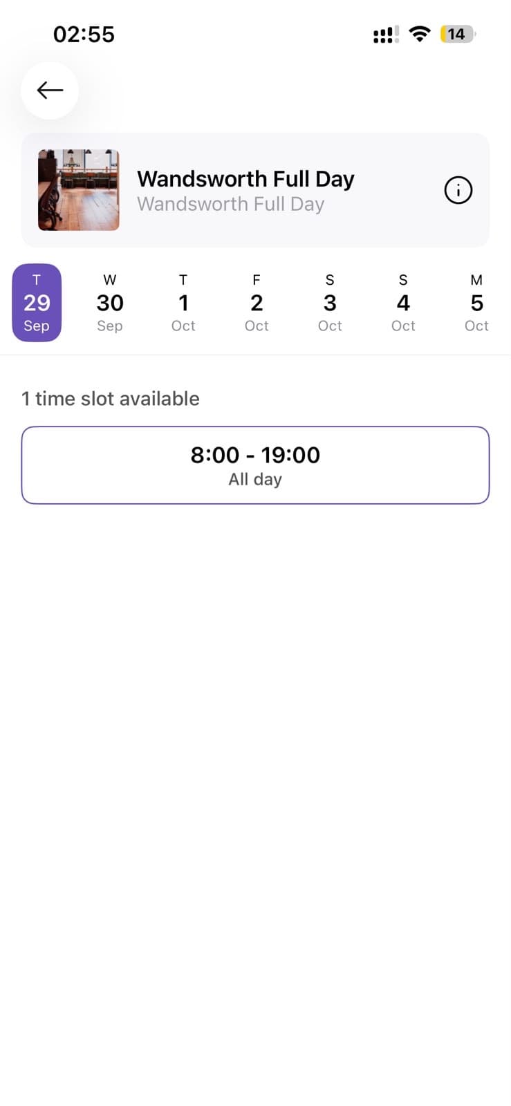
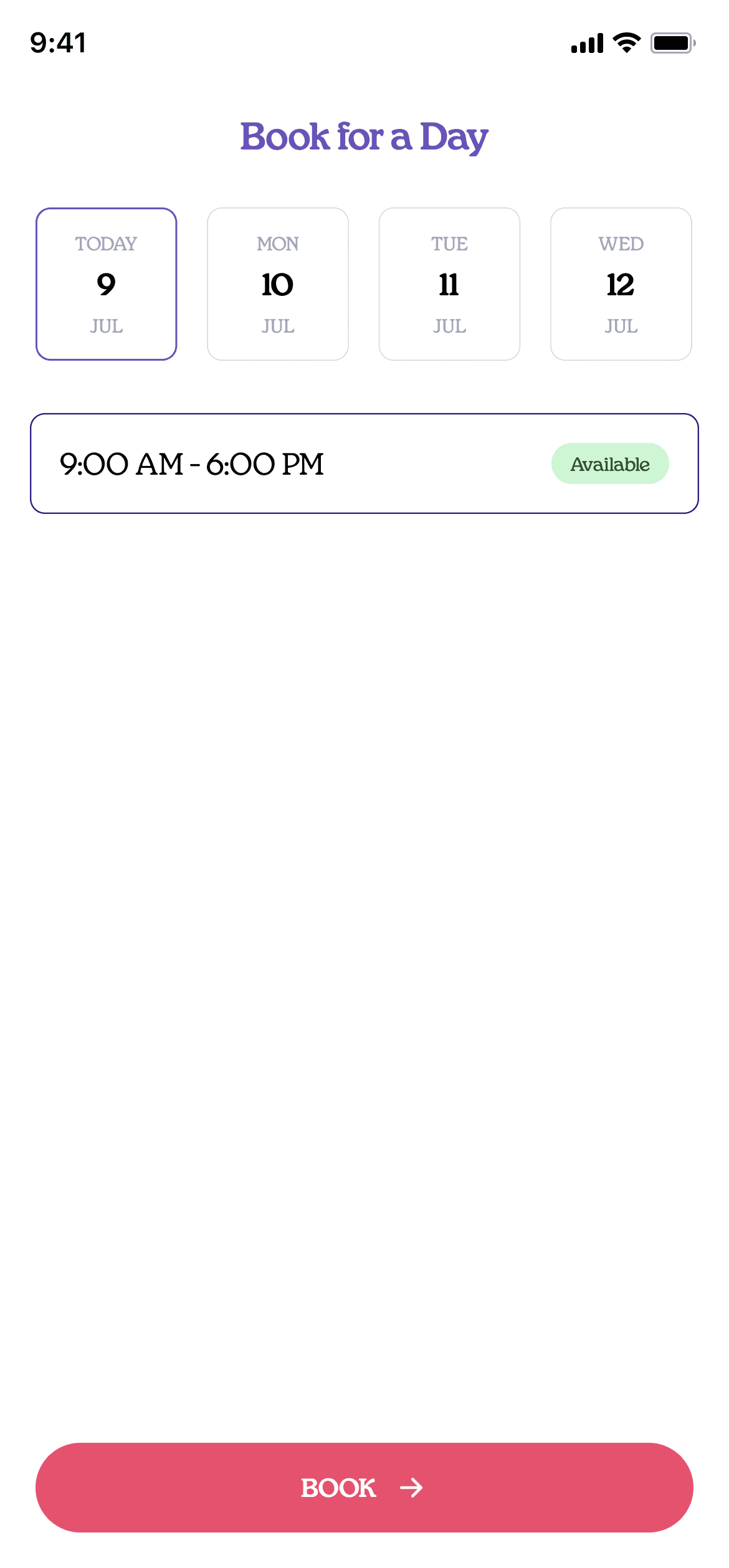
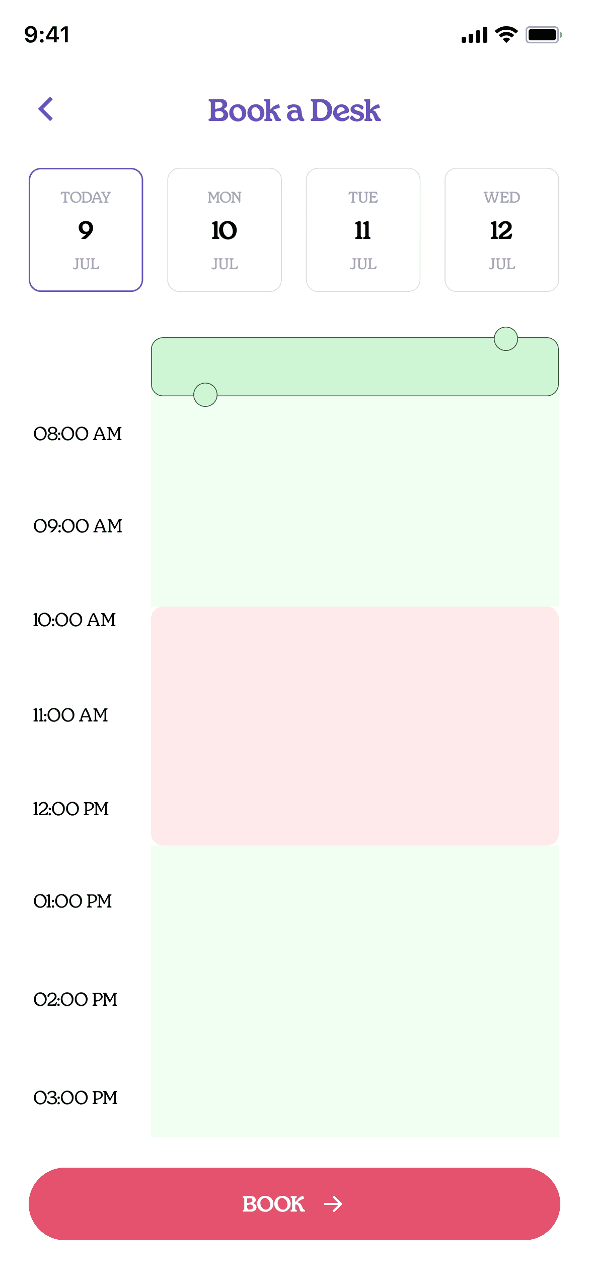
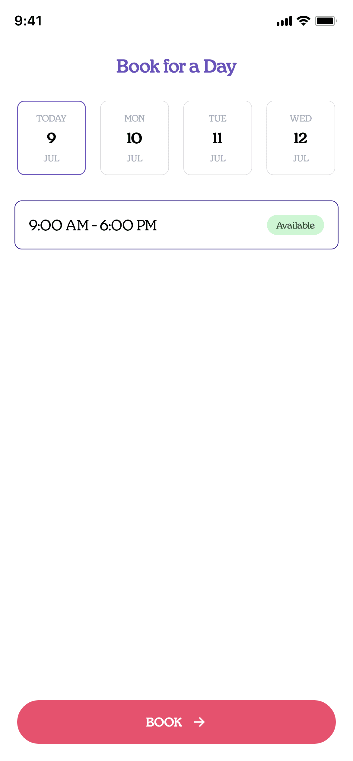
Removed the duplicate Full Day cards
The old Full Day screen showed the same card twice, then made you pick a slot on top, which added taps. Now you pick a day and book.
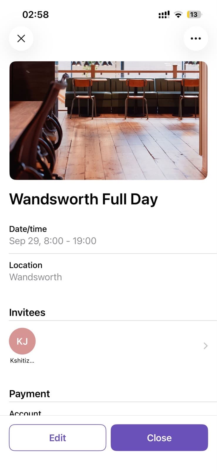
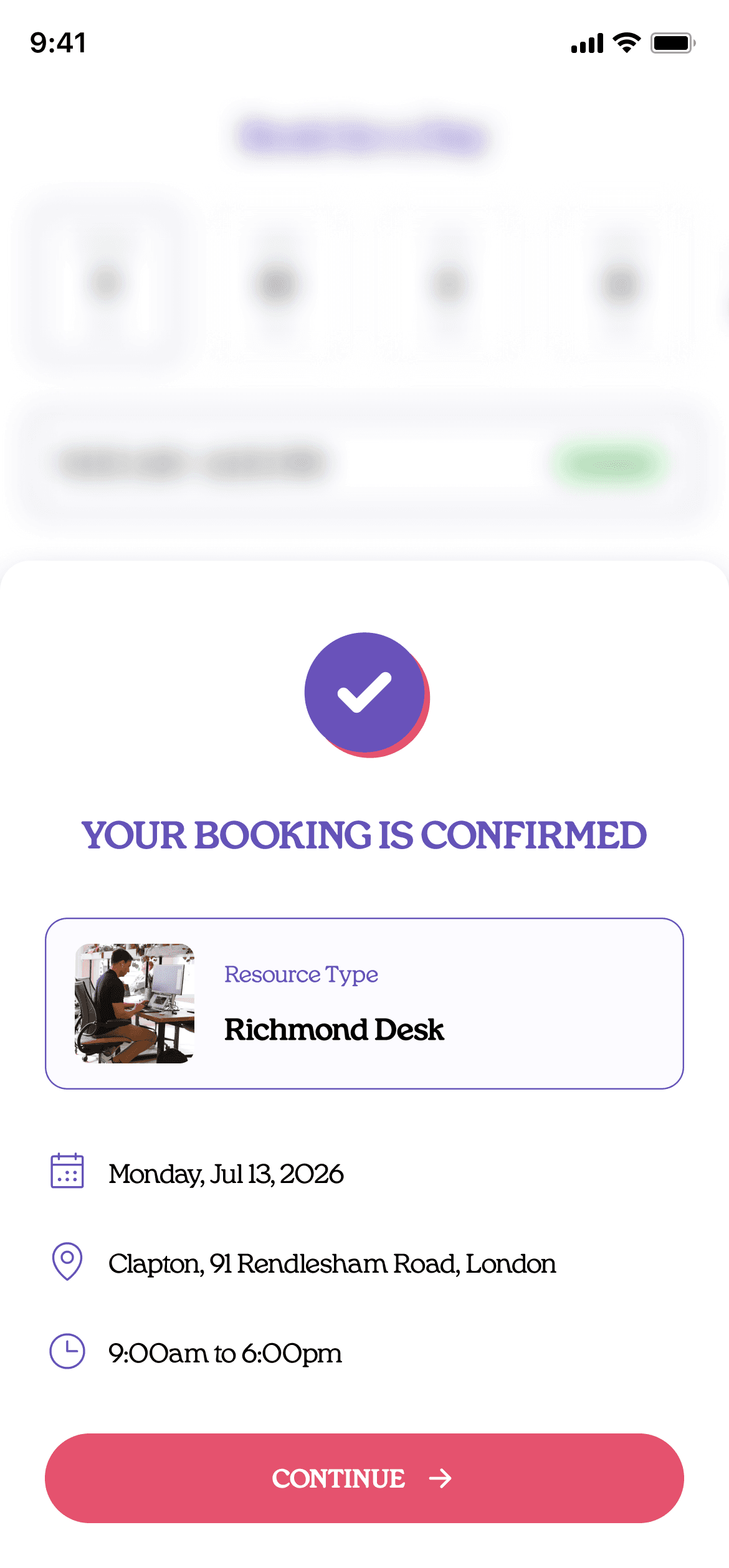
Booking confirmation
A sheet comes up with the resource type, the date, the hours and the address of the club you booked.
Access the space CTA
Once a booking is live, Book a desk turns into Access the space.
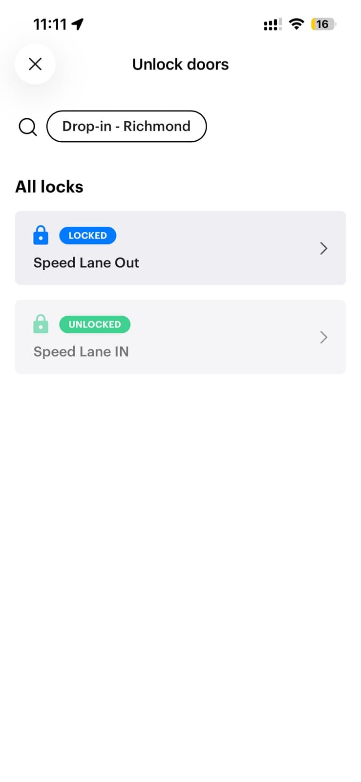
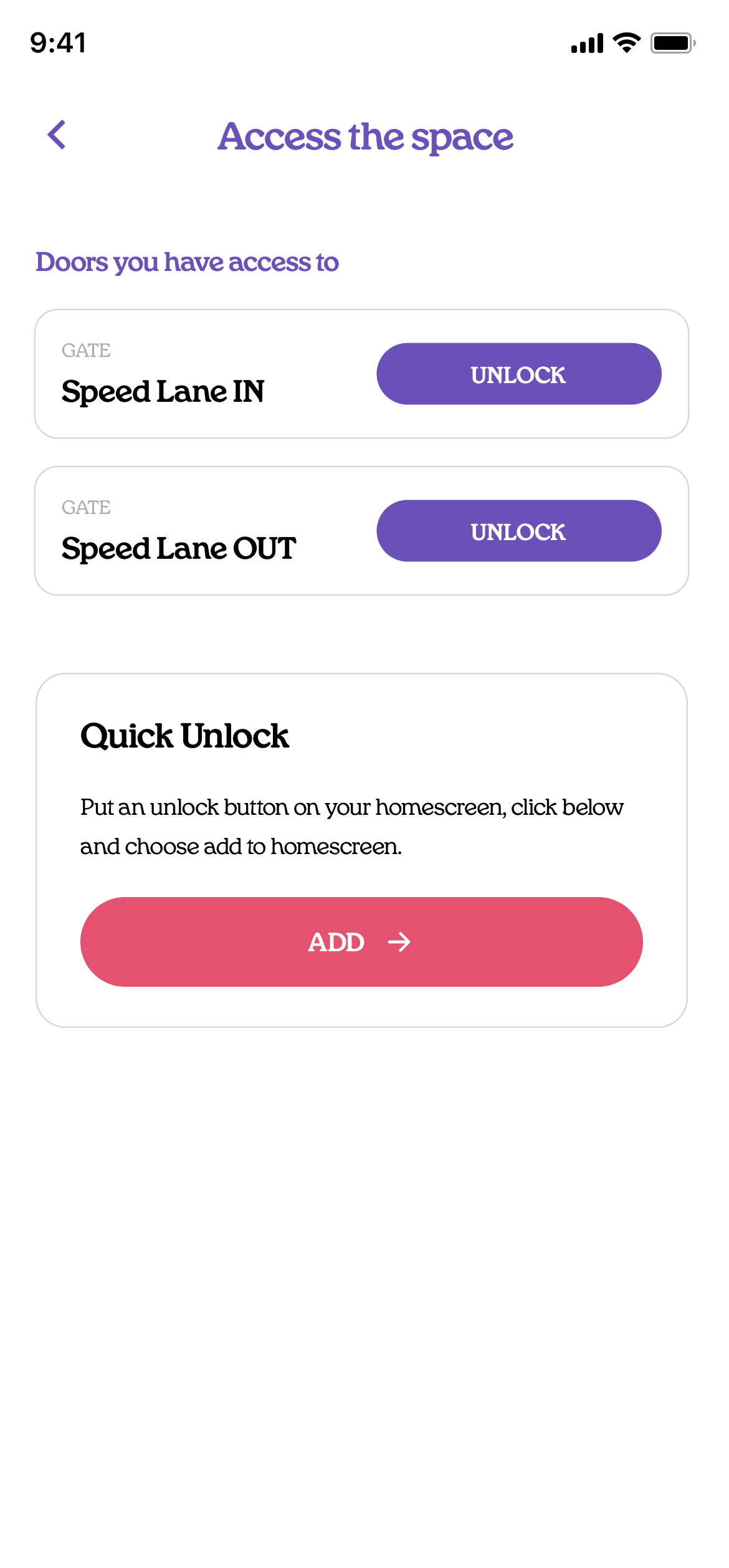
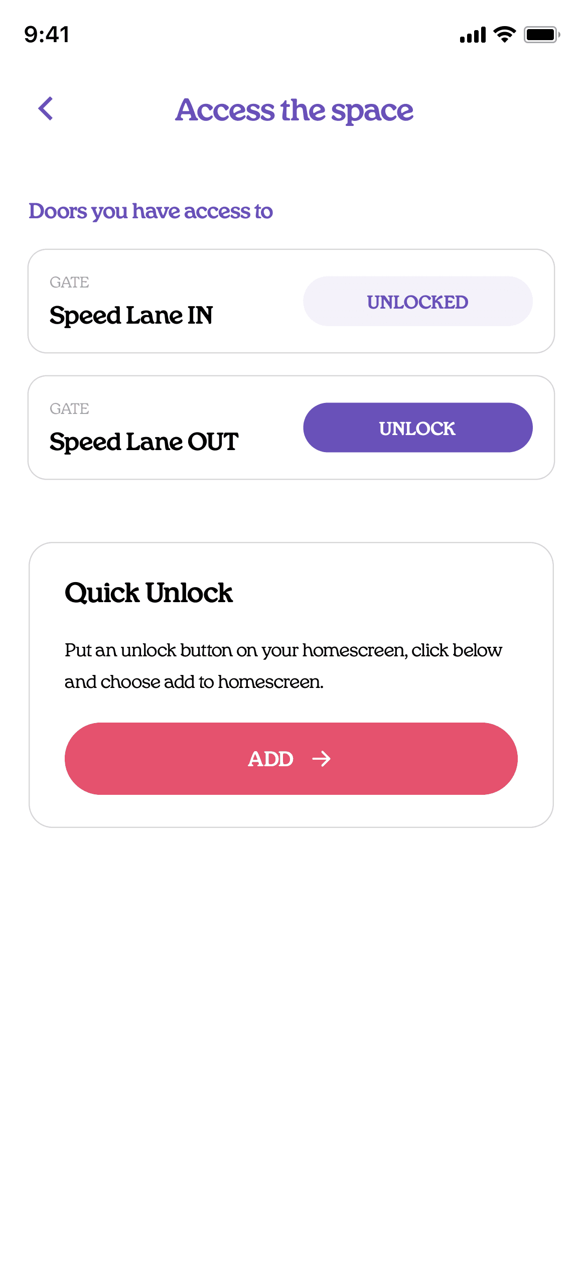
Door unlock screen
The same screen carries a Quick Unlock card: put the unlock button on your Home Screen, and you stop having to open the app every time you need a gate.
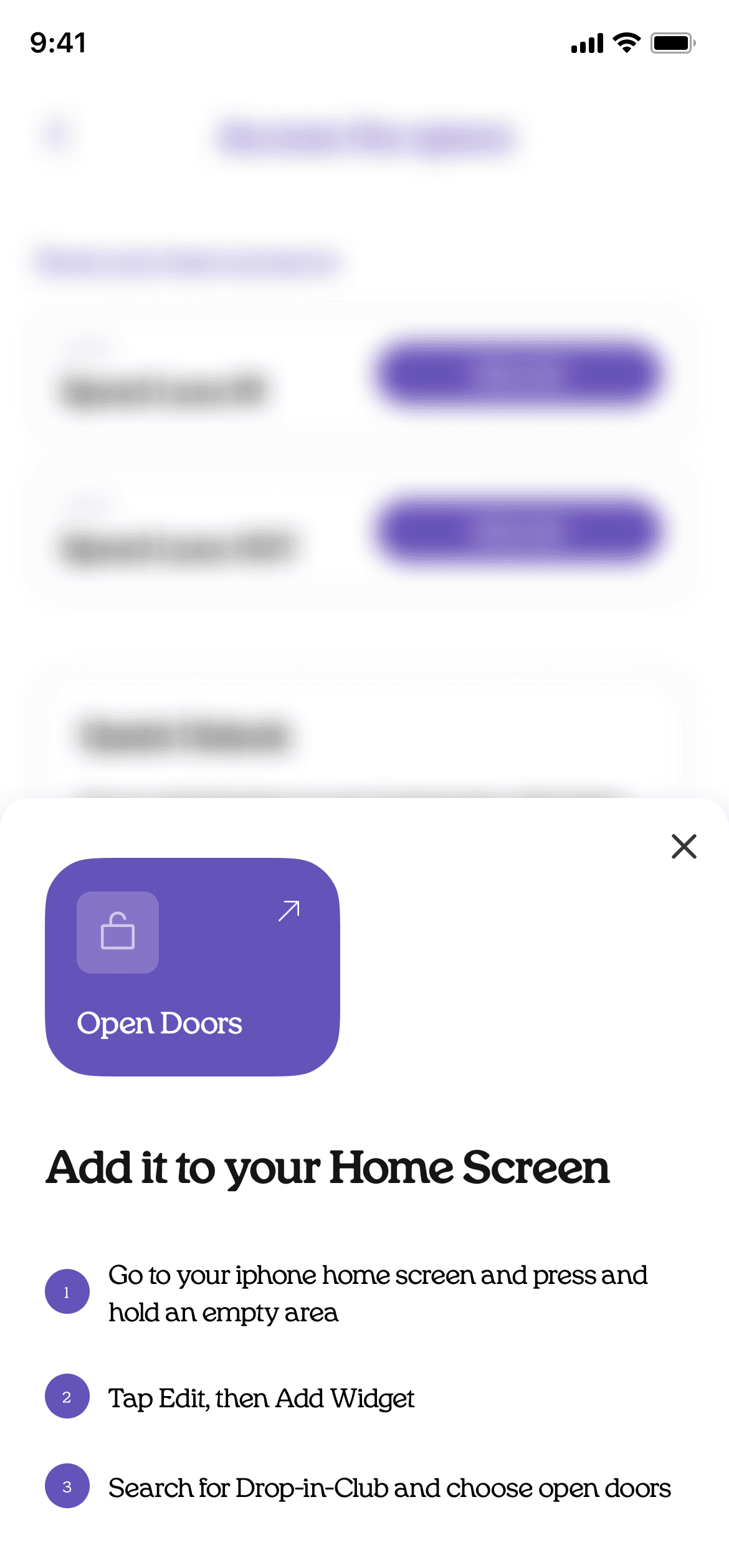
Open Doors widget
Three steps put it on your Home Screen. After that, getting in never involves opening the app at all.
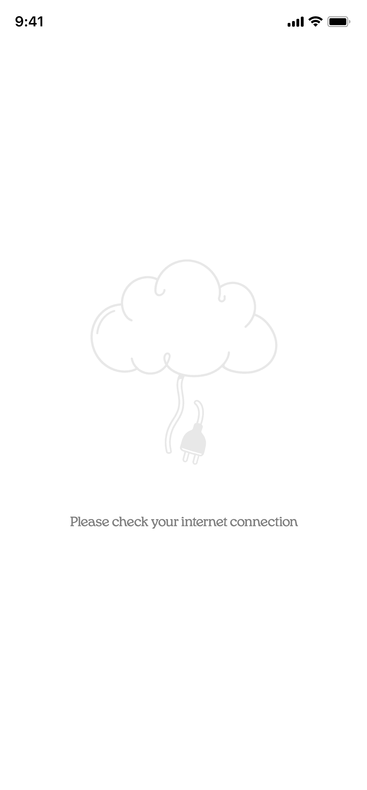
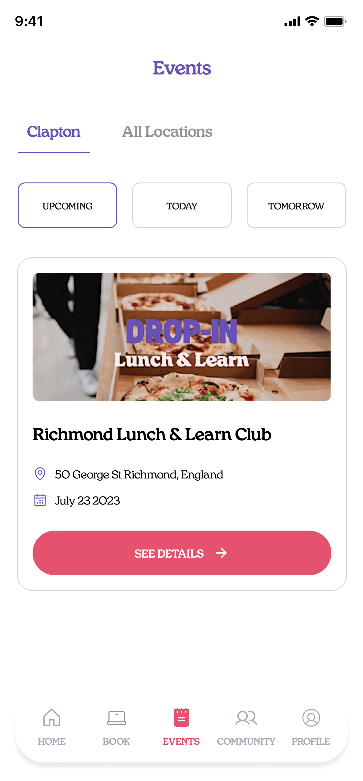


Building it with AI
This was the first time I built an iOS app by myself. I never really liked coding, but with agentic AI tools like Claude Code and Codex, it has become much easier to build apps when you have the right guardrails in place.
While I was building it, my biggest concern was the API call limits of the Optix API. I wanted to make sure the app would continue to work as we scaled, so I had several meetings with the Optix team. We eventually used the per-member API to solve this problem.
This project also taught me a lot about how AI can make mistakes if you don’t prompt it well or give it the right guardrails. I ended up creating a framework for consistently getting the output I wanted from Claude by using different MCPs, including Mobbin, LottieFiles, Magnific, and Figma. These helped give Claude the context it needed to produce better results.
Impact
These are some of the success metrics, where the north star is bookings per day. Not sharing the numbers publicly for confidentiality reasons :)
Booking metrics
Access metrics
Qualitative
Thanks for reading.